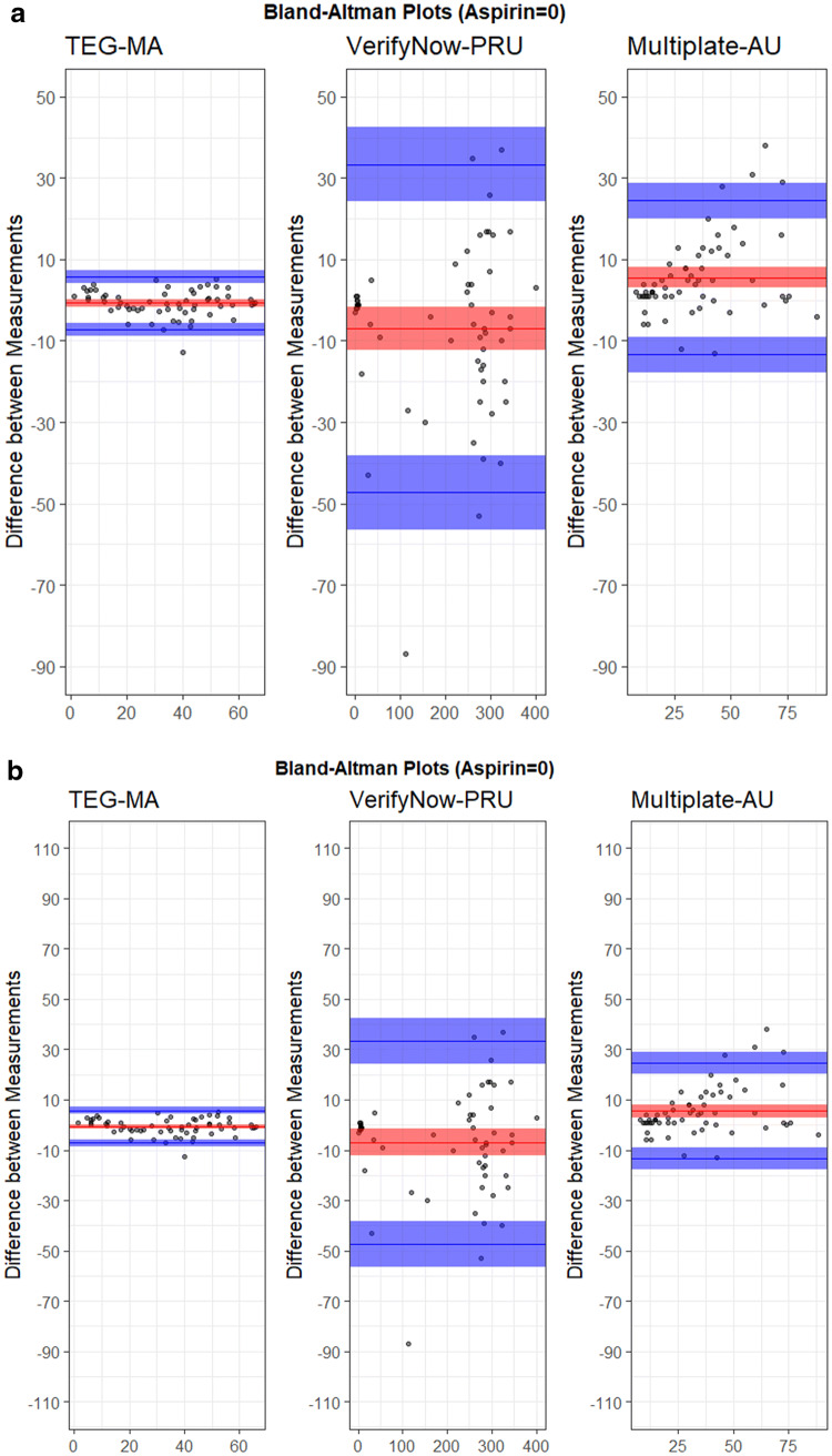
Fig. 2.
Device variability analysis for a unscaled data, and b data scaled to EC50. The plots show the difference between measurements versus the mean of measurements. Blue lines show minimum and maximum values with respective confidence intervals, red lines show the average value with confidence interval

