
FIGURE 7.
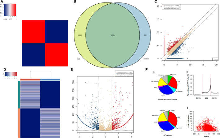
A, Heat map of correlation coefficient from test group and control group. The colours in the panel represent the correlation coefficient of the two samples. Blue shows the two samples have a low correlation coefficient, and red shows the high similarity of the two samples. The plots are performed in R gplots package. B, Venn diagram of the genes number. The plot shows the number of genes methylated in both groups and the number of specific methylated genes. These plots are performed in R VennDiagram package. C, Scatter plot between two groups. RPM values of all identified methylated genes are plotted. The values of X and Y axes in the scatter plot are the averaged RPM values from each group (log2‐scaled). Genes above the top line (red dots, up‐regulation) or below the bottom line (blue dots, down‐regulation) indicate more than 2.0 fold change (default fold change value is 2.0) between the two compared groups. Brown dots indicate methylation level without differentially expression. D, Heat map of gene expression. The heat map shows the 500 genes with the largest coefficient of variation (CV) based on RPM counts. Each row represents one gene, and all the 500 genes are categorized into 10 clusters based on K‐means clustering. Each column represents one sample. The colour in the panel represents the relative expression level (log2‐transformed). The colour scale is shown below: blue represents an expression level below the mean; red represents an expression level above the mean. The coloured bar top at the top panel showed the sample group, and the coloured bar at the right side of the panel indicates the 10 divisions which were performed using K‐means. These plots were performed in R heatmap2 package. E, Volcano plot for test vs control. Red/blue curves indicate 2.0 fold change of differentially methylated gene with statistical significance (red: up‐regulated; blue: down‐regulated). Brown curve indicates non‐differentially methylated gene; fc or q‐value is not satisfied. The values of X and Y axes in the volcano plot are the fold change (log2‐transformed) and P‐value (‐log10‐transformed) between the two groups, respectively. F, m6A peak distribution. Transcriptome‐wide distribution of m6A peaks. Pie chart shows the percentage of non‐IP reads (top) and m6A peaks (bottom) within distinct regions of RNA; NP stands for non–protein‐coding genes, whereas PR stands for protein‐coding genes. Distribution of m6A peaks along mRNA (no figure if not all of 5’UTRs, CDSs and 3’UTRs exist). 5’UTRs, CDSs and 3’UTRs of each transcript are separately binned regions spanning 1% of their total lengths; Y‐coordinates represent percentage of m6A peaks located in each bin. Correlation between gene expression level and m6A peak enrichment. The peak enrichment value relative to the transcript abundance within the input RNA is plotted