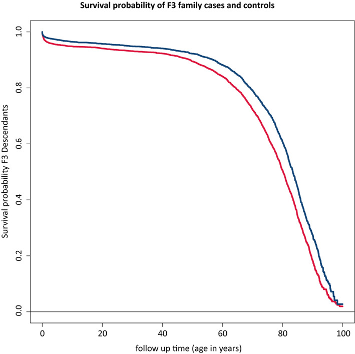
Figure 3.

Survival differences between family‐based cases and their spouses. This figure shows the survival curve for the difference in survival between the F3 family cases and controls. The figure is connected to Table 3a which shows the hazard ratios corresponding to the difference between the two curves. Blue color represents the cases, and red color represents the controls
