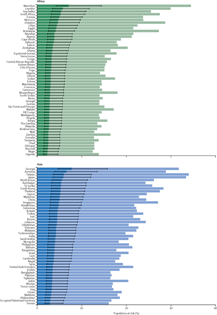
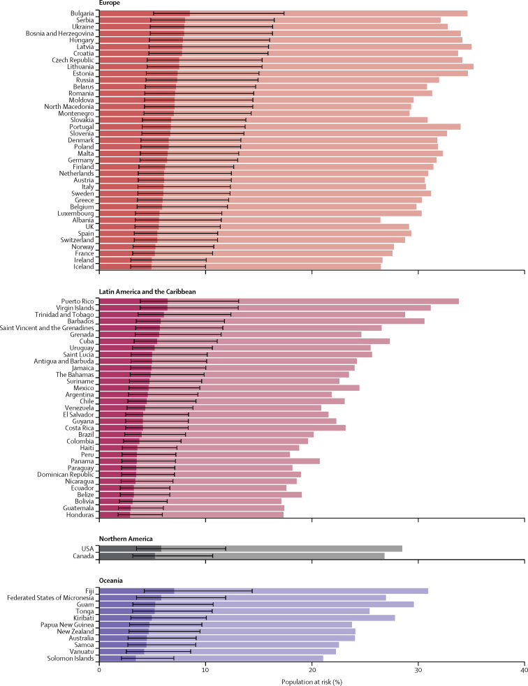
Figure 3.
Proportion of population at increased risk and high risk of severe COVID-19 by country and region
The total length of each bar represents the share of the population at increased risk (ie, those with at least one condition listed as at increased risk in current guidelines); this excludes individuals considered to be at increased risk by virtue of their age alone. The darker bars represent the share of the population at high risk (ie, those that would require hospital admission if infected), with thin bars representing uncertainty intervals. Here, the population at risk is not age standardised. Thus, differences between countries are driven by differences in the population structure, as well as differences in risk at equivalent ages. This is appropriate when calculating the number and percentage of country populations that might need to be shielded or vaccinated. Another version of this figure shows the age-standardised population at risk (assuming the same population structure in each country), and thus allows more direct comparison of the risk at equivalent ages in different countries (appendix p 16).


