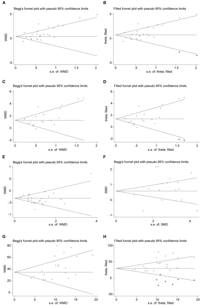
Figure 7.
Funnel plots of comparison of the included studies. (A,B) Funnel plot and adjusted funnel plot of mean difference in WBC count. (C,D) Funnel plot and adjusted funnel plot of mean difference in neutrophil count. (E) Funnel plot of mean difference in lymphocyte count. (F) Funnel plot of Std. mean difference in PCT. (G,H) Funnel plot and adjusted funnel plot of mean difference in CRP.

