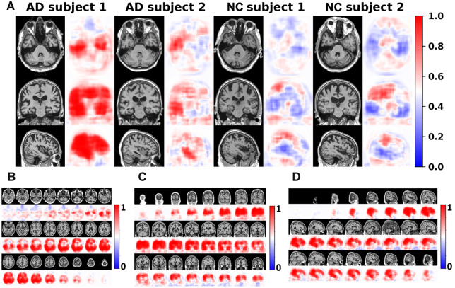
Figure 2.
Subject-specific disease probability maps. (A) Disease probability maps generated by the FCN model highlight high-risk brain regions that are associated with Alzheimer’s disease pathology. Individual cases are shown where the blue colour indicates low-risk and red indicates high-risk of Alzheimer’s disease. The first two individuals were clinically confirmed to have normal cognition whereas the other two individuals had clinical diagnosis of Alzheimer’s disease. (B–D) Axial, coronal and sagittal stacks of disease probability maps from a single subject with clinically confirmed Alzheimer’s disease are shown. All imaging planes were used to construct 3D disease probability maps. Red colour indicates locally inferred probability of Alzheimer’s disease >0.5, whereas blue indicates <0.5. AD = Alzheimer’s disease; NC = normal cognition.

