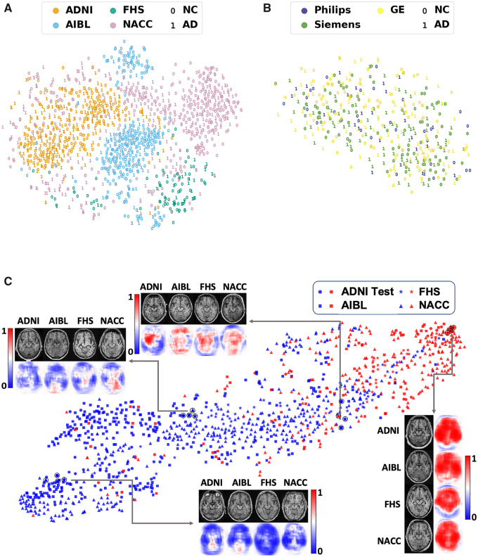
Figure 6.
Visualization of data. (A) Voxel-level MRI intensity values from all four datasets (ADNI, AIBL, FHS and NACC) were used as inputs and a two-dimensional plot was generated using t-SNE, a method for visualizing high-dimensional data. The colour in the plot represents the site and the digit ‘0’ was used to present cases who had normal cognition (NC) and the digit ‘1’ was used to show cases who had confirmed Alzheimer’s disease (AD). (B) This t-SNE plot was generated only on using the ADNI dataset, where the colour was used to represent the scanner. The digit ‘0’ was used for normal cognition cases and ‘1’ for Alzheimer’s disease cases. (C) FCN-based outputs that served as input features to the MLP model were embedded in a two-dimensional plot generated using t-SNE for the two classes (Alzheimer’s disease and normal cognition). The colour (blue versus red) was used to distinguish normal cognition from Alzheimer’s disease cases, whereas a unique symbol shape was used to represent individuals derived from the same cohort. Several individual cases that were clinically confirmed to have Alzheimer’s disease or normal cognition are also shown (indicated as a black circle overlying the respective datapoint). The plot also indicates co-localization of subjects in the feature space based on the disease state and not on the dataset of origin.

