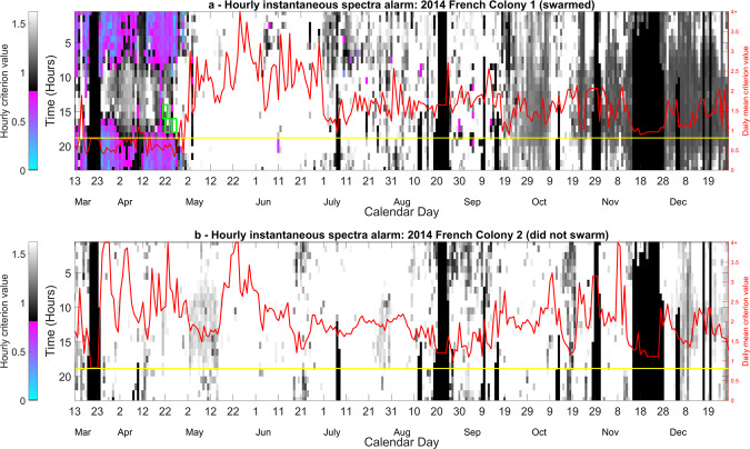
Figure 3.
Time course of the swarming alert for a specific colony that (a) swarmed and (b) did not swarm, using the DF spectra in Fig. 2. The instantaneous alarm (computed without any contribution coming from past data) for these two colonies was monitored from the 13th March until 1st December 2014. The colour coding has been split to clearly convey two very different pieces of information. Greyscale tones correspond to the alarm values above the threshold (non-swarming state) and the remaining colour emphasises the alarm values below the threshold (swarming state), from pink to blue as the criterion approaches the swarming centroid. Green rectangles show the occurrence of three swarms within this dataset, with the earliest one being the primary swarm. Superimposed is another, red curve, with its own Y-axis shown on the extreme right, showing the average of the previous night’s alarm values taken between midnight and 5:00 AM. The yellow line displays the alarm threshold. Note that the black sections seen within the hourly alarm plots are the result of missing data, due to power cuts. This figure was created using the MATLAB (R2018b) software (uk.mathworks.com).

