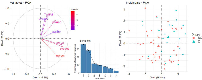
Figure 2.
Principal Component Analysis of the expression levels of the YWHA genes at baseline. The Variables-PCA graph (left) displays the variable correlation plots of the principal component analysis with the respective contribution of each genes’ expression level indicated with a color gradient (contrib). The scree plot (center) indicates the percentage of the variance explained by each dimension. Dimensions 1 and 2 explain 35.8% and 27.9% of the variance respectively. The Individuals-PCA graph (right) displays the first two components values obtained for each participant. Values for converters (C) and non-converters (NC) are represented by blue triangles and red circles, respectively. The mean value for each group is represented by a larger symbol.

