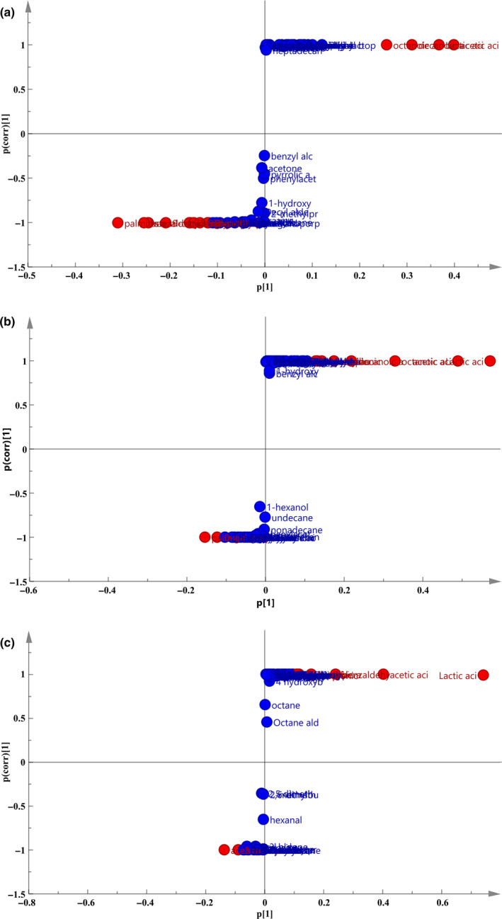
FIGURE 4.

S‐plot diagram of different fermentation time. a: 0 and 8 hr; b: 8 and 16 hr; c: 16 and 48 hr. Each point in the diagram represents a metabolite. The farther the point in the figure is from the center, the more significant the change in metabolites
