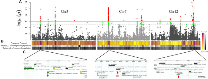
FIGURE 3.

Selection sweep analysis and candidate genes for weedy rice pericarp color. (A) GWAS results of weedy rice pericarp color in Chr3 Chr7 and Chr12 presented as Manhattan plot. (B) The upper colored line in the figure is π unimproved population/π per 500 kb genomic window improved population. Red indicates the P value above the threshold. P-values determined based on Bonferroni correction method. In order to increase the possibility of overlapping with the selection signal, we reduced P by an order of magnitude based on the Bonferroni correction, which is indicated by the green peak. Red regions indicates the strong selection, whereas the green regions indicates weak selection. The middle and lower grayscale lines are Tajima’s D of the unimproved population and Tajima’s D of the improved population, respectively. The darker the color, the greater the intensity of the selection. (C) For each response peak, the chromosomal locations of the candidate genes for weedy rice pericarp color are shown.
