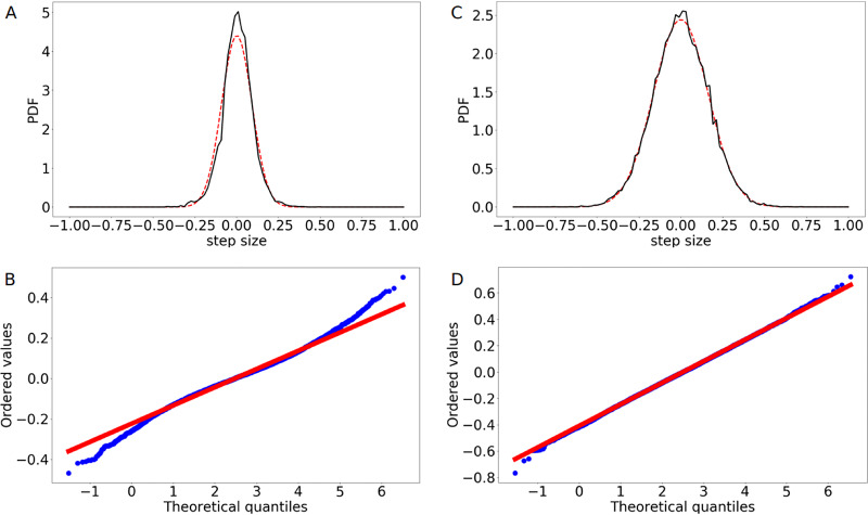
FIG 7.
Analysis of the step size distribution of the ori movement. (A) Calculated PDF of the step size distribution along the longitudinal axis of the cell for the experimental data (black line) compared to a fitted normal distribution (red line). (B) Probability plot comparing the experimental data (blue points) to a normal distribution (red line). (C) Calculated PDF of the step size distribution along the longitudinal axis of the cell for the simulation data (black line) compared to a fitted normal distribution (red line). (D) Probability plot comparing the simulation data (blue points) to a normal distribution (red line). While the numerical results can be well represented by a Gaussian distribution, the experimental one differs from a normal distribution, as can be seen at the tails of the probability plot. However, the plot shows a reasonably linear pattern in the center of the data. The deviations could be due to experimental difficulties in tracking slow movement. Step size distributions were calculated from 80 individual runs.

