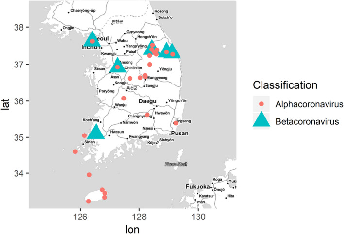
Figure 1.

Map of geographical distribution of coronaviruses investigated in this study. Alphacoronavirus and betacoronavirus are depicted with red circle and green triangle, respectively. The map was built using ggmap and ggplot2 packages on R version 3.5.1
