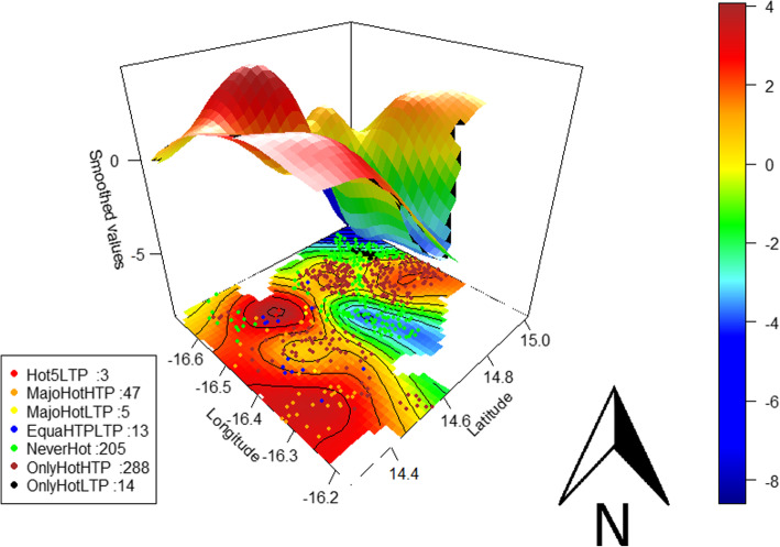
Fig. 5.
Spatial distribution of the different hotspot types and the associated spatial risk of being hotspot. The black curves are the contours of bivariate smoothed values; the colour bar is the ascending level of risk indicated by the spline smoothing function values (smoothed values) from blue to red; red dots represent the villages that were a hotspot during all 5 LTPs (Hot5LTP), orange dots those that were a hotspot mainly during HTPs (MajoHotHTP), yellow dots those that were a hotspot mainly during LTPs (MajoHotLTP), blue dots those that were a hotspot equally during HTPs and LTPs (EquaHTPLTP), green dots those that were never a hotspot (NeverHot), brown dots those that were a hotspot only during HTPs (OnlyHotHTP), and black dots those that were a hotspot only during LTPs (OnlyHotLTP)

