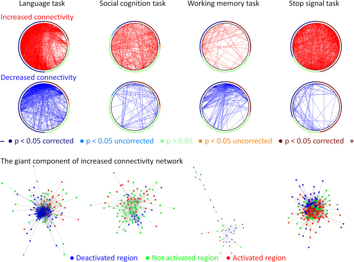
Figure 8.
Relationships between the task modulated connectivity and regional activation levels. The upper 2 rows show circular plots of increased (red) and decreased (blue) connectivity in different tasks. The regions along the circle were ordered based on their activations in each task, and were colored based on their statistical significance levels. The bottom row illustrates the network layouts of the first giant component of increased connectivity network using Yifan Hu’s algorithm. Node colors in the network layout represent the activation levels in each task.

