FIGURE 1.

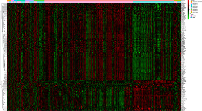
The heat map of top 100 DEGs in AD compared with normal control. Row and column represented DEGs and GEO data, respectively. The color scale represented the expression levels

The heat map of top 100 DEGs in AD compared with normal control. Row and column represented DEGs and GEO data, respectively. The color scale represented the expression levels