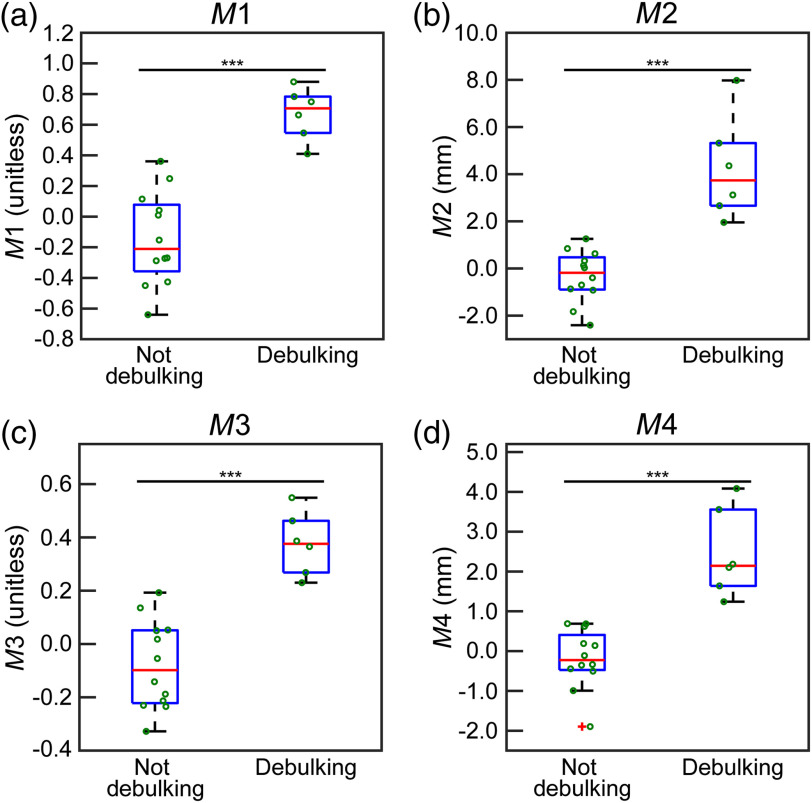
Fig. 5.
The box plots representing sorting the patients into debulking or not using the four different classification equations described in Sec. 2.1. In all panels, the axis is the value obtained using Eqs. (1)–(4). The box on the left side of each panel is the distribution of values below or equal to the threshold of the method (not debulking), and the right side is the distribution of values above the threshold (debulking). In all plots, the central red line designates the median, and the bottom and top of the boxes are the 25th and 75th percentiles, respectively. The green circles visualize all patient data. (a), (b), (c), and (d) The results of , , , and , respectively. (*** indicates ).

