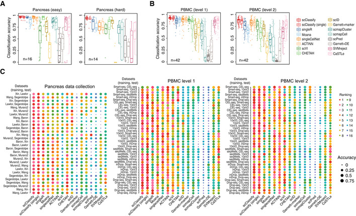
Figure 2. Benchmarking scClassify against alternative methods on cell type classification of the pancreas and PBMC data collection (see also Fig EV2).

- Performance evaluation for 16 methods on 30 training and test data pairs from the pancreas data collection. Each boxplot ranges from the first to third quartile of classification accuracy for each method with the median of classification accuracy as the horizontal line. The lower and higher whiskers of boxplot are extended to the first quartile minus 1.5 interquartile range and the third quartile plus 1.5 interquartile, respectively.
- Performance evaluation for 16 methods on 84 training and test data pairs from the PBMC data collection. Each boxplot ranges from the first to third quartile of classification accuracy for each method with the median of classification accuracy as the horizontal line. The lower and higher whiskers of boxplot are extended to the first quartile minus 1.5 interquartile range and the third quartile plus 1.5 interquartile, respectively.
- A 1‐by‐3 panel of dot plots indicating the rankings of each method in 114 pairs of reference and testing data pairs. The x‐axis refers to the different methods, and the y‐axis refers to the reference and testing data pairs. The dots are coloured by rank, and the size of the dots indicates the degree of accuracy.
