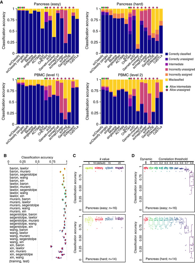
Benchmarking results for 16 different methods. Each bar indicates the composition of predicted categories of the average performance in a collection of reference–testing pairs. We divided reference–test pairs into four groups: pancreas (easy), pancreas (hard), PBMC (level 1) and PBMC (level 2).
Each box indicates the classification accuracy by subsampling 80% of training data, repeated 10 times, using 30 training and test data pairs from the pancreas data collection. The red dots indicate the classification accuracy of using the full training data. Each boxplot ranges from the first to third quartile of classification accuracy with the median as the horizontal line. The lower and higher whiskers of boxplot are extended to the first quartile minus 1.5 interquartile range and the third quartile plus 1.5 interquartile, respectively.
Each box indicates the classification accuracy with different number of nearest neighbours (k = 5, 10, 15 and 20) to be considered in the weighted kNN, using 30 training and test data pairs from the pancreas data collection, with 16 easy cases (top panel) and 14 hard cases (bottom panel). Each boxplot ranges from the first to third quartile of classification accuracy with the median as the horizontal line. The lower and higher whiskers of boxplot are extended to the first quartile minus 1.5 interquartile range and the third quartile plus 1.5 interquartile, respectively.
Each box indicates the classification accuracy with different correlation thresholds determined, either dynamic or pre‐defined (ranging from 0 to 0.8), using 30 training and test data pairs from the pancreas data collection, with 16 easy cases (top panel) and 14 hard cases (bottom panel). Each boxplot ranges from the first to third quartile of classification accuracy with the median as the horizontal line. The lower and higher whiskers of boxplot are extended to the first quartile minus 1.5 interquartile range and the third quartile plus 1.5 interquartile, respectively.

