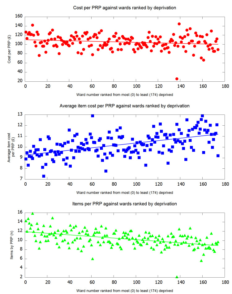
Figure 4.
Line graphs to demonstrate the association between items prescribed and costs of the items. The top graph demonstrates the cost per PRP over 6 months against deprivation, showing that cost per PRP increases with increasing deprivation. The middle graph demonstrates that the average item cost per PRP increases with decreasing deprivation. The bottom graph demonstrates that the number of items per PRP increases with increasing deprivation. The correlation coefficient calculated by Kendall’s tau is depicted on the bottom right of each graph. PRP, practice-registered patient.

