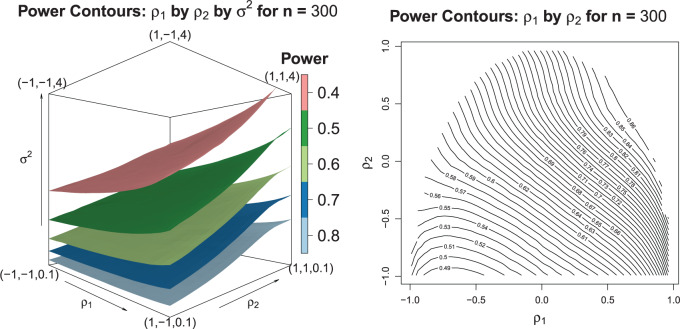
Fig. 2.
The left-hand plot shows the 3D contours of the power (denoted by shade/color) as a function of  where
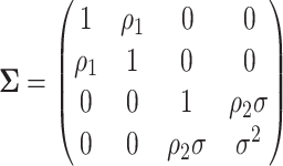
where  and the fourth EDTR is best.
  and
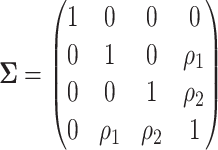
and  . The right-hand plot shows power contours over the correlations where
  . Note that the power appears monotone with respect to
  and
and  . The finger-shaped boundary is due to the feasible region of values for
  and
and  such that
  is positive definite. The sequence of contour curves in the left-hand plot in ascending order from
  to
to  corresponds to the order of the power key from 0.8 to 0.4.

