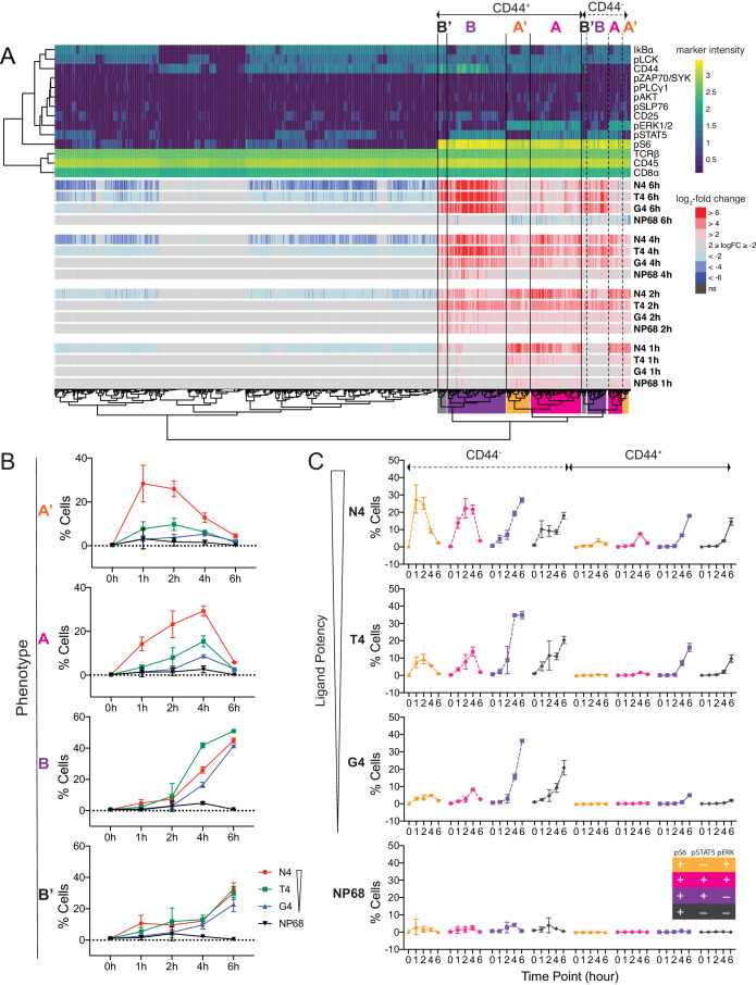
Figure 4. Examination of multi-dimensional phenotypes in mass cytometry signalling data.
(a) Mass cytometry stimulation time courses were further investigated for multidimensional phenotypes that changed in abundance with stimulation. Analysis was run on two multiplexed biological replicates as described in Materials and methods. Phenotypic hyperspheres were defined within the multidimensional mass cytometry space and abundances of cells from each condition enumerated within each hypersphere. Each column in the heatmap represents an individual hypersphere. At the top of the heatmap, rows correspond to mass cytometry marker measurements with colour depicting the intensity of each marker in each hypersphere. Clustering by Pearson correlation was performed on these hypersphere marker intensity measurements. At the bottom of the heatmap, rows correspond to stimulation conditions with colour depicting the binned log2-fold change in cellular abundance in stimulated versus unstimulated conditions within each hypersphere. ns = hyperspheres that did not significantly change in abundance. Phenotypic clusters of interest, A, A’, B, B’, are indicated in both CD44+ and CD44- populations by coloured highlighting of the dendrogram. Statistics underlying the heatmap are provided in Supplementary file 5. (b) Percentages of cells exhibiting A, A’, B, and B’ phenotypes in mass cytometry measurements. Results are combined data from six biological replicates measured in two independent experiments as detailed in Supplementary file 1. Points represent the mean and error bars depict the SD. Data underlying plots are provided in Supplementary file 5. (c) Phenotypes as in (b) further sub-divided by CD44 expression.


