
FIGURE 2.
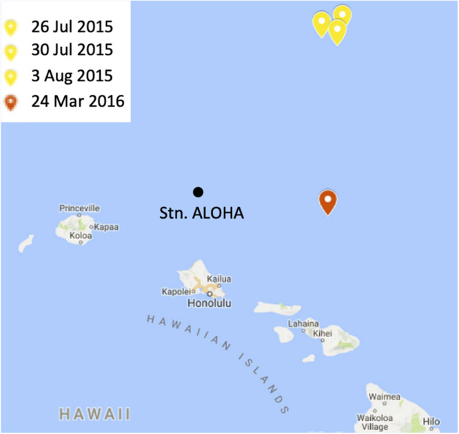
A map of the study site. The locations and dates of sampling during the summer 2015 and spring 2016 cruises are indicated in yellow and red, respectively. Station ALOHA is shown for context. The figure was made in Microsoft PowerPoint 2013 by modifying Hawaiian Islands Google Map (Map data ©2019, Google). https://www.google.com/maps.