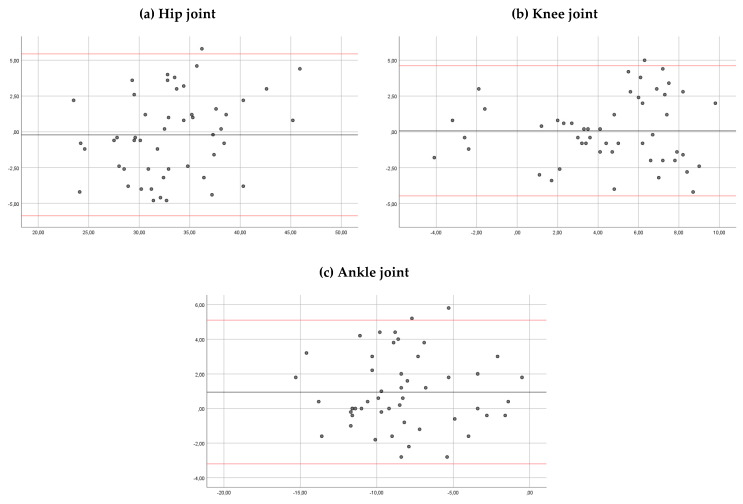
Figure 4.
Bland–Altman plots comparing results between sessions of measurements (for observer 1) for the hip ankles (a), knee angles (b) and ankle angles (c). Bias (black line) and limits of agreement (red lines) are shown for each parameter. The mean score is plotted on the x-axis, and the difference between sessions (mean of the differences) is plotted on the y-axis (mean difference ± 1.96 SD).

