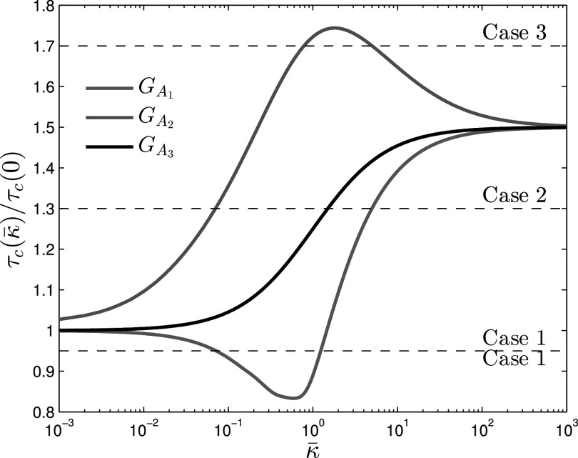
Fig. 3.
Normalized epidemic threshold  as a function of relative alerting rate
  , showing three dependency scenarios. All three alert layers have the same spectral radius with respect to
  i.e.,
i.e.,  . Therefore, in all of them the threshold value
  starts from
  and converges to
  . Graph
  is synthesized such that
  . From the red curve we can observe that
  decreases for small
  values after which it increases. Graph
  is synthesized such that
  . In this case the blue curve
  is maximal around
  . The topology of graph
  is
is  with reduced weights and is represented by the black epidemic threshold curve which increases monotonically by
  .
.

