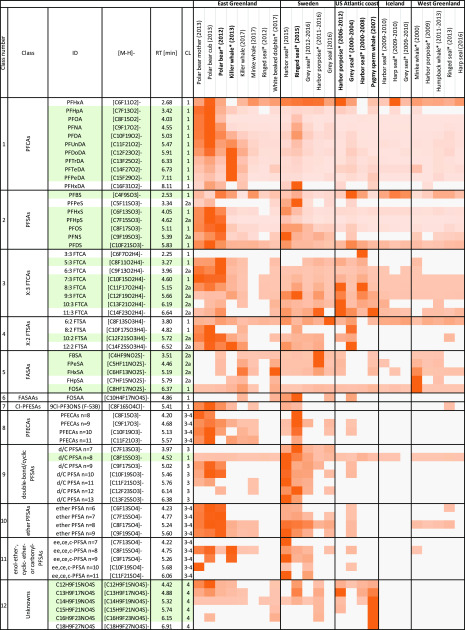
Figure 5.
Heatmap showing relative abundance of PFASs identified by suspect screening across all samples. Data are normalized row-wise based on the maximum response observed across all samples for a given substance. Darker orange indicates high abundance, and lighter orange indicates low abundance. White indicated non-detects. Green shading denotes suspects identified by CompoundDiscoverer in contrast to manual inspection of the data. Bold font indicates samples where a significant gap in EOF was identified. CL = confidence level, * = pooled samples (n = 2–10).

