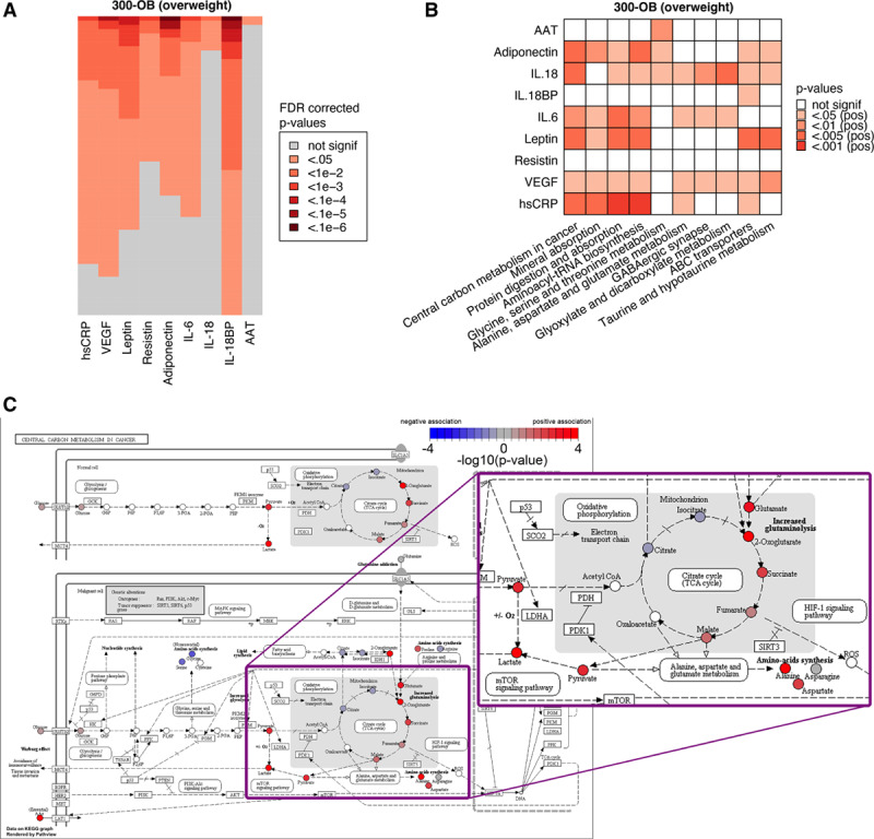
Figure 6.

Metabolic comparison between normal weight and overweight individuals. A, Visualization of the top 5% of metabolites (lowest P values) associated with each of the circulating markers of inflammation to give an impression of the number of significant metabolites. For each marker, the false discovery rate (FDR)-corrected P values were sorted independently to show the relative number of significant metabolites for each marker. B, Top 10 metabolic pathways associated with circulating markers of inflammation in the 300-OB cohort. See Methods for details. C, Example pathway plot of Central Carbon Metabolism in Cancer for VEGF in the 300-OB cohort. Significance is indicated as −log10 (P values), any P value below P=1×10⁻⁴ is rounded up to 1×10⁻⁴ for this visualization. Red indicates a positive association, blue indicates a negative association, and white indicates that the metabolite was not present in our data. Visualization was performed using Pathview.23 The portion of the figure showing the TCA cycle is shown as a zoomed-up inset.
