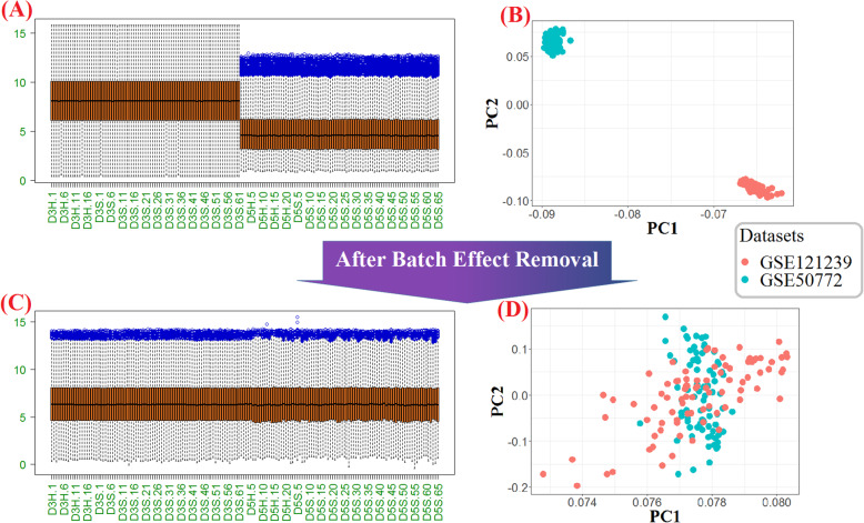
Fig. 2.
Graphical demonstration of the batch effect removal using ComBat for Affymetrix platforms. Boxplot (a) and PCA plot (b) show the gene expression distributions and the samples of microarray datasets before batch effects removal respectively. As the same way, Boxplot (c) and PCA plot (b) show the corresponding concepts after batch removal. The boxplots distributions show the normalization and decreasing technical diversities between datasets; and in the horizontal axis, the jth healthy control subjects and the jth SLE patient in the ith dataset were illustrated with DiH.j and DiS.j, correspondingly. In the PCA plots, each dot represents one sample, and the color indicates its dataset

