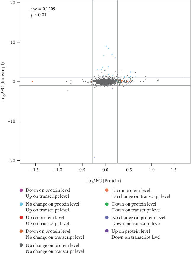
Figure 5.

A scatter plots of the expression levels of all proteins and their associated transcripts in both groups. Note: the abscissa in the figure indicates the difference in the expression of the protein in the EPE treatment group and the control group, and the ordinate indicates the difference in the FPKM value of the corresponding transcript in the experimental group and the control group. Each point represents a protein and its associated transcript; in the upper left corner, rho represents the Pearson's correlation coefficient between the two omics, p represents the correlation test p value; when rho > 0, it is called the negative correlation; When rho < 0, it is called positive correlation; when rho = 0, it is called zero correlation, that is, there is no correlation; the larger the∣rho∣, the greater the correlation between the two omics.
