. 2020 May 26;9:e52868. doi: 10.7554/eLife.52868

Figure 1. Nuclei serve as pacemakers to organize mitotic waves.

(A) Mitotic waves (orange) in a kymograph of cell-free extract experiment in a 100 µm Teflon tube. Wave dynamics are shown for cell cycle 1–6. For each time point we reduced the data from two to one spatial dimension by plotting the maximal GFP-NLS intensity along the transverse section of the tube. In the zoom, indicated by the gray box, we show snapshots of the whole 100 µm wide tube for different time points. The pacemaker location in cell cycle six is indicated by P. Approx. 250 nuclei/µl are added. (B) Analysis for the experiment in A. Left: GFP-NLS intensity profile, averaged over the times between the mitotic waves in cell cycle 5 and 6. The GFP-NLS intensity is highest close to the pacemaker region P. Middle: Difference in cell cycle period (with respect to the fastest period) at different locations along the tube, averaged over cell cycle 1–6, showing that the pacemaker region oscillates fastest. Right: Mean distance from the center of each nucleus to its two nearest neighboring nuclei. The nucleus close to the pacemaker region P is most separated from its neighbors. (C) Mitotic waves in a 200 µm Teflon tube shown by a fluorescent microtubule reporter (HiLyte Fluor 488).

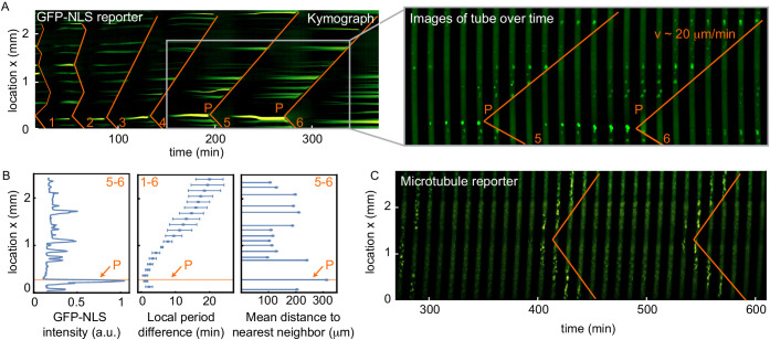
Figure 1.

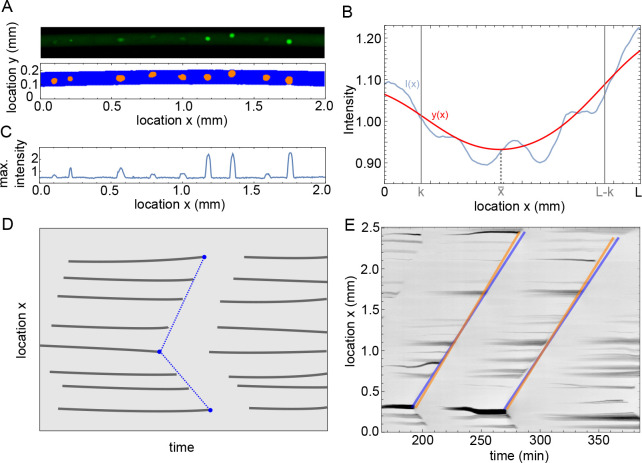
Figure 1—figure supplement 1. Methodology of image analysis of the experiments.

Figure 1—figure supplement 1.

(A) Example of microscope image (top) and binarized image from ilastik (bottom), with in blue pixels recognized as background and orange the nuclei. (B) Intensity profile I(x) in blue and the filtered profile y(x) in red. The domain width is equal to L and the parameter k determines the boundary domain. (C) Maximum intensity over y as function of x, calculated for the microscope image in A. (D) Sketch of analysis of mitotic waves in a kymograph. At every time a profile is calculated as in C, when this is plotted over time the appearance and disappearance of nuclei is visible. The disappearance of nuclei is manually detected by visual inspection, as indictated by the blue points. Our program then automatically draws lines between these points, representing the mitotic waves, and calculates periods and wave speeds. (E) Example of the methodology sketched out in panel D for actual data, showing two (parts of) mitotic waves. The orange and blue lines illustrate errors that could be made visually, but they lead to relatively small differences in estimated period and wave speed (up to 1 min difference in estimated period and up to 2 µm/min difference in estimated wave speed).
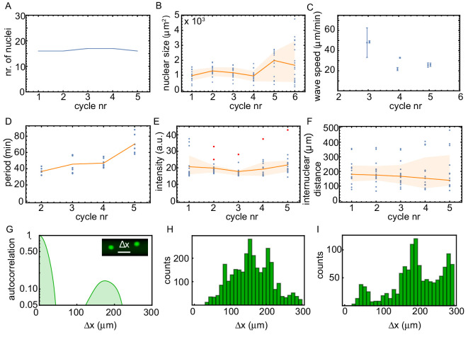
Figure 1—figure supplement 2. Analysis of the experiment in panel A, quantifying the time evolution of the number of nuclei, the nuclear size, the internuclear distance, the oscillation period, the intensity of the nuclei, and the observed wave speed.

Figure 1—figure supplement 2.

Analysis of the experiment shown in Figure 1. We plotted as function of the cycle number: the number of nuclei (A), the nuclear size (B), the observed wave speed (C), the period of the oscillation (D), the intensity of the nuclei (E), and the internuclear distance (F). Blue is individual data, orange lines give the median and the orange area is the 2/3 σ-interval. Red dots in (E) highlight the nuclei that are pacemakers. The internuclear distance is further analyzed in panels G and H, showing the averaged autocorrelation of projected binarized images (G) and a histogram of the distances between nuclei for all binarized images (H). Both analyses of the nuclear distribution show that the distance between neighboring nuclei is typically around 150 µm. (I) shows the same analysis as in (H), but now for an experiment in a 100 µm Teflon tube for ≈ 60 added sperm nuclei/µl.
Figure 1—figure supplement 3. Analysis of the spatial GFP-NLS intensity profile and the internuclear distances for multiple experiments.

Figure 1—figure supplement 3.

Kymographs of the GFP-NLS intensity for eight additional experiments in tubes of 100 and 200 µm, with a corresponding analysis of the spatial GFP-NLS intensity profile and the internuclear distances. The dots on the kymographs indicate the location of the pacemakers for two consecutive cell cycles indicated in blue and orange.
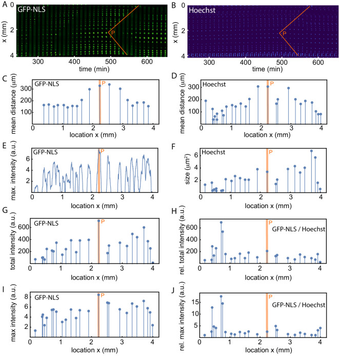
Figure 1—figure supplement 4. Analysis of the spatial GFP-NLS and Hoechst intensity profile and the internuclear distances.

Figure 1—figure supplement 4.

(A) Mitotic waves (orange) in a kymograph of cell-free extract experiment in a 200 µm Teflon tube, using the GFP-NLS reporter. (B) Same as A, but using DNA staining (Hoechst 33342). C-J show an analysis of the experiment in A-B. (C,D) Mean distance from the center of each nucleus to its two nearest neighboring nuclei using the GFP-NLS and the Hoechst signal, respectively. (E) GFP-NLS intensity profile, averaged over the times between two mitotic waves. (F) Nuclear size in a single cell cycle determined from the Hoechst signal. G. Total GFP-NLS intensity per nucleus in a single cell cycle. (I) Maximal GFP-NLS intensity per nucleus in a single cell cycle. (H, J) Total and maximal GFP-NLS intensity per nucleus normalized by the nuclear size in a single cell cycle.
Figure 1—video 1. Video of the cell-free extract experiment in panel A, B.
Download video file (691.6KB, mp4)
8.86 hr of experiment in 484 frames, scale bar is 200 µm.
Figure 1—video 2. Video of the cell-free extract experiment in panel C.
Download video file (918.3KB, mp4)
15.68 hr of experiment in 79 frames, scale bar is 200 µm.