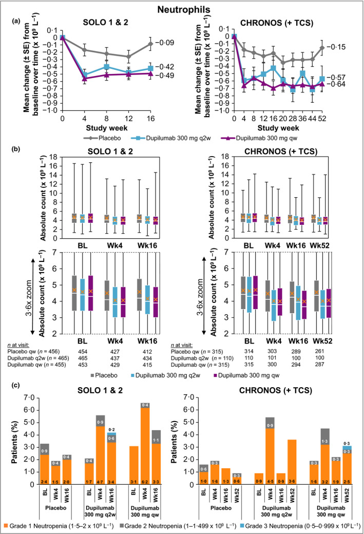
Figure 3.

(a) Mean change in neutrophil count from baseline to week 16 (SOLO 1 & 2) and week 52 (CHRONOS). (b) Absolute neutrophil count. A close‐up view of the box‐and‐whisker plots is depicted below. White horizontal lines indicate medians. X depicts mean values. Top and bottom of each box represent Q3 and Q2, respectively. Upper and lower vertical bars represent Q4 and Q1, respectively; horizontal segments on each end of the vertical bars represent minimum and maximum values. (c) Proportion of patients with neutropenia grades 1–3; patient numbers are provided in Table 2. The neutropenia grade scale follows the guidance provided by the U.S. Food and Drug Administration.37 BL, baseline; Q, quartile; qw, once weekly; q2w, every 2 weeks; TCS, topical corticosteroids; Wk, week.
