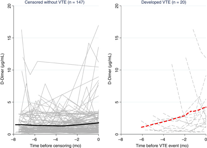
Figure 1.

Line plot of D‐dimer trajectories in patients who did (right, gray dashed lines) and did not (left, gray solid lines) develop VTE during follow‐up. Each line represents the D‐dimer trajectory of a single patient. The bold solid line (left) and bold dashed line (right) represent moving averages (locally weighted sum of squares [LOWESS] nonparametric smoother). Although D‐dimer remained relatively constant over time in patients who did not develop VTE, it increased steadily in patients before the onset of VTE. Note that the time on the x‐axis of both panels is inverted (i.e., it represents the time before the onset of VTE or censoring without VTE).
