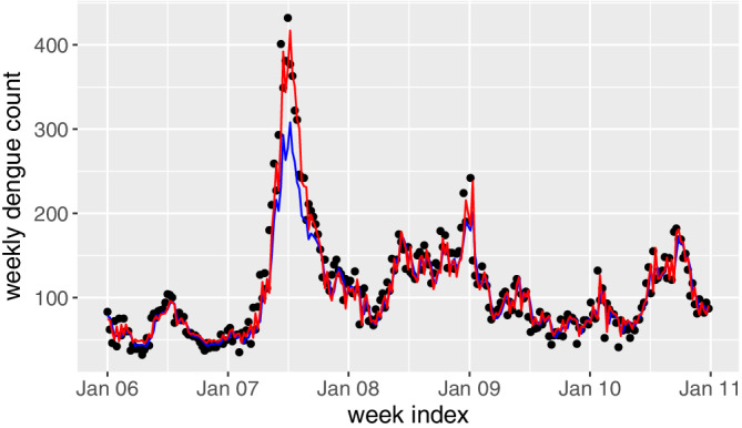
Figure 2.

Fitted weekly dengue counts in 2006 to 2011 based on the proposed generalized additive model. The black points denote the observed dengue incidences, the blue line denotes the predicted results by the selected dataset and the red line denotes the predicted results by the whole phase I dataset [Colour figure can be viewed at wileyonlinelibrary.com]
