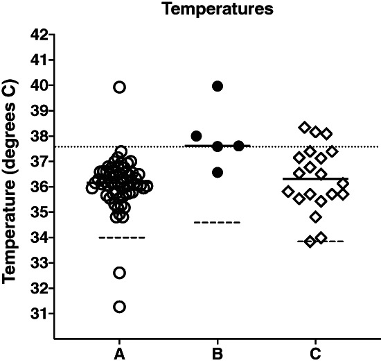
Figure 1.

This graph plots the maximum temperatures recorded in each patient. Solid lines represent the mean of the maximum temperatures in each group. The dashed lines indicate the mean of all temperature values recorded in each group. A dotted line across the graph shows 37.5°C. Group B has significantly higher maximum temperatures (ANOVA, P < 0.002).
