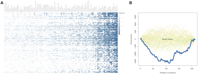
Figure 2.
Web server visualisation of case study results. (A) Category (x-axis) to precursor (y-axis) heatmap with −log10-scaled enrichment P-values for the first case study. (B) GSEA plot with simulated background distributions (green to orange lines) and actual depletion for breast cancer (dark blue line) observed during evaluation of the second case study.

