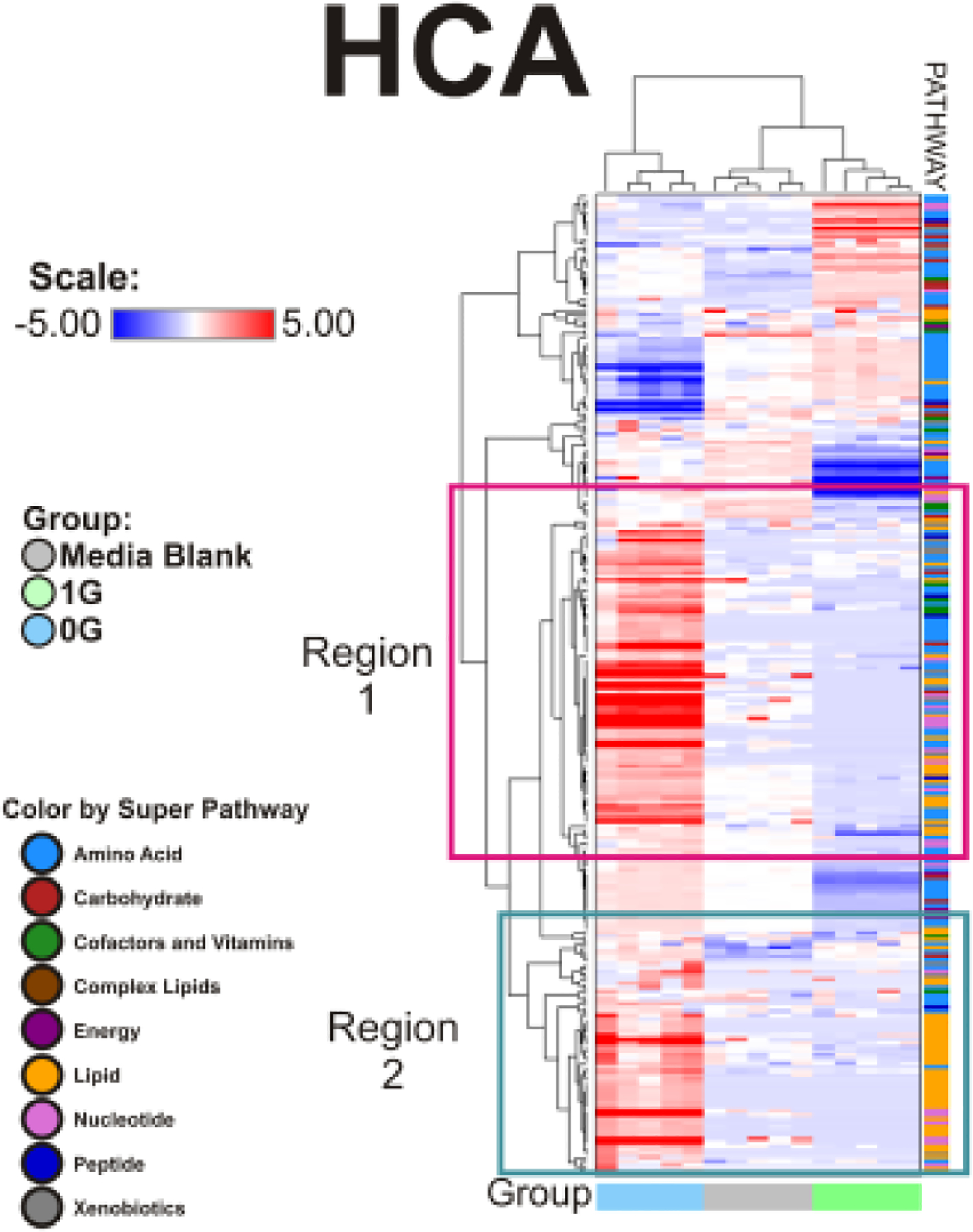
Figure 10. Hierarchical clustering analysis (HCA).

evaluates the variable clustering patterns of the 252 metabolites for production and consumption in OLPs exposed to 0G or 1G. The data is shown in a table format, where the rows represent individual metabolites and the columns represent the serum sample it is derived. The color in each cell reflects the concentration level of each metabolite to its corresponding sample, relative to its mean concentration level across the entire set of tissue samples. Respectively, the colors red, blue, and white within the table indicate an increase, decrease, or no significant change of metabolites. The pathways the metabolites belong to are indicated to the right of the HCA. The HCA compares the metabolite change between the 0G, 1G, and control groups. n = 5 samples per group. HCA data analysis were generated using ArrayStudio.
