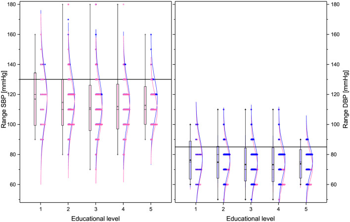
Figure 5.
Box plots and distributions of the blood pressure parameters for the different educational levels. From left to right: SBP, and DBP. Each box corresponds to standard deviation around the mean (star). Distribution dots correspond to each subject (pink for female and blue for male), the curve is the best Gaussian fit of the data, and horizontal lines correspond to thresholds defining health.

