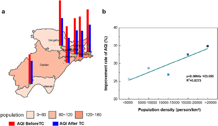
Fig. 1.
The geography of Monitoring stations, and the relationship between AQI and population. a, The spatial distribution of AQI and population (10,000 people) in Wuhan, AQI before lockdown (red) and after (blue). b, The relationship between the improvement rate of AQI and population density. (For interpretation of the references to colour in this figure legend, the reader is referred to the web version of this article.)

