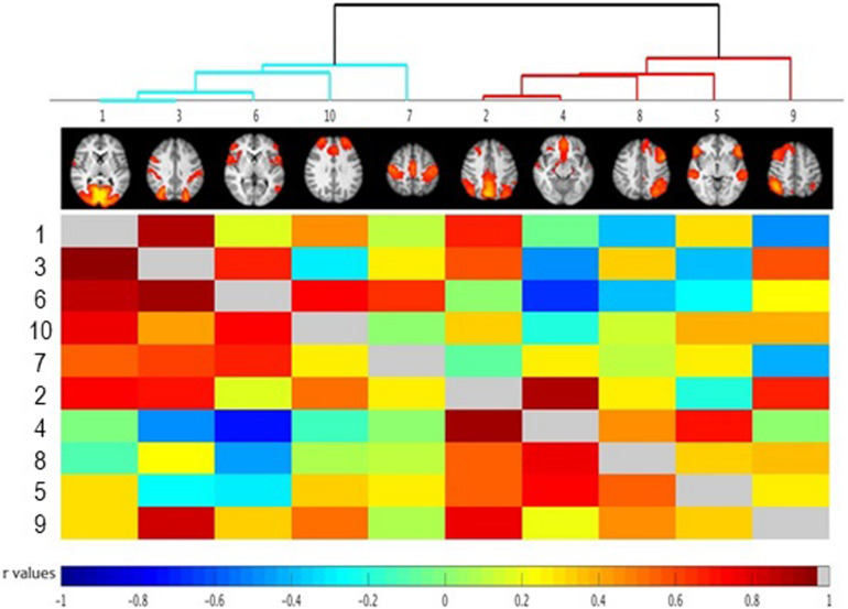
FIGURE 3.
FSLNets results of between network correlations (N = 30). Each independent component (IC) is denoted by one column and a corresponding raw. The colored matrix displays the correlations of the time series between networks pairs. Dark red squares indicate highly positive correlations, light green indicates a near-0 correlation, and dark blue represents highly negative correlation as denoted on the scale at the bottom of the figure. Full correlations between networks pairs are shown below the diagonal line (in gray) with partial correlations shown above the diagonal line (for detailed description of full and partial correlation please see main text). Groups of highly correlated ICs were clustered together according to a hierarchical clustering algorithm (visualized at the top of the matrix as a clustering tree). Please note that the color cut-off for hierarchical tree is arbitrary – just for visualization purposes. Numbers indicate specific independent components as described in Table 1. The ICs have been reordered, according to a hierarchical clustering algorithm. Small images at the top of each column summarize each IC’s spatial map, with the right side of the images representing the left side of the brain. As described in the main text, the between-network connectivity was not modulated by trait impulsivity score.

