Fig. 2.

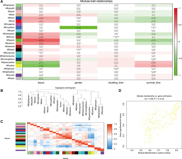
(A) Heat map of the correlation between the modules and the clinical features of the patients. The number above represents the correlation, and the number below represents the P‐value. Red represents a positive correlation, and green represents a negative correlation. (B) Module and clinical hierarchical clustering diagram used to summarize the modules generated in WGCNA. The yellow module is most closely related to tissues. (C) Heat map of module adjacency. (D) Scatter plot of the yellow module eigengenes.
