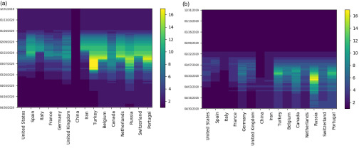
FIG. 2.
Heat maps track the changing cluster membership of the 15 most severely impacted countries with respect to their counts of (a) cases and (b) deaths, respectively. Cluster membership, determined by Ckmeans.1d.dp, depicts COVID-19 severity relative to the rest of the world. Clusters are ordered with 1 being the worst impacted at any time. Darker and lighter colors correspond to smaller and greater numbered cluster labels and represent worse and less affected clusters, respectively.

