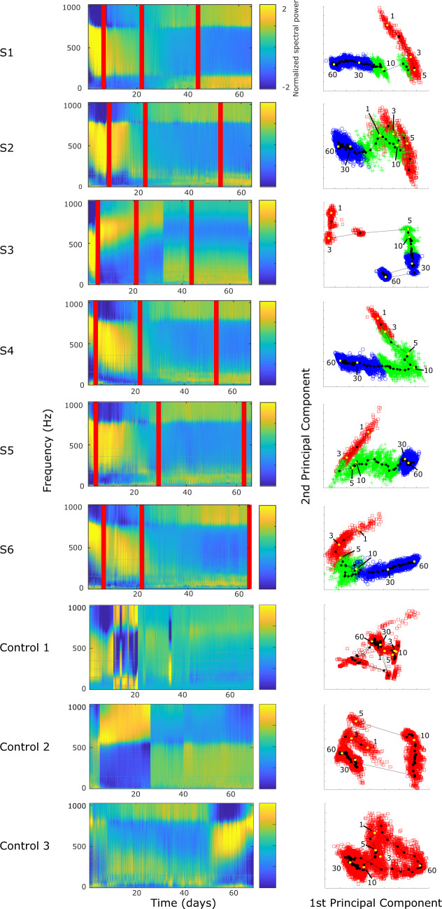
Figure 7.
Probing analysis—(Column 1) Power spectral density for each averaged electrically evoked response, plotted for each Experimental animal (S1–S6) and Control animals (Control 1–3) over the course of the study. The power bands were individually normalized by subtracting the mean and dividing by the standard deviation to highlight changes in a single frequency band over time. In each Experimental animal’s plot, there are three vertical lines. The first line corresponds to the day that seizures first commenced. The second indicates the point of inflection separating the Rising- and Falling-seizure phases. The third shows the day of the last recorded seizure. These lines were not included for the Control animals, as they did not have seizures. (Column 2) Frequency information from the analyses were investigated by PCA, and the first two principal components are plotted and labelled based on their epileptogenic phase membership (red ‘squares’ = Pre-seizure phase, green ‘+’ = Rising-seizure phase, blue ‘o’ = Falling-seizure phase). As seen in the figures, all three phases were quite distinct in all Experimental animals. The PCA was performed separately for each of the nine subjects. In order to demonstrate the temporal evolution of the induced responses, the first and second principal component values were segmented based on day and their centroids were calculated and plotted in the line-dot graph. Centroids from Days 1, 3, 5, 10, 30 and 60 are white and labelled. Days 21 and 22 for Control 1 were redacted from the figure, as they were corrupted by artefact.

