Figure 8.
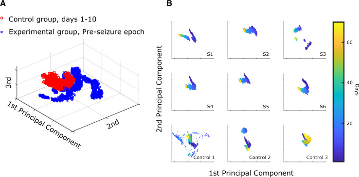
Qualitative differences between Experimental and Control evoked responses—(A) aggregate of all evoked response data from the Pre-seizure phase of all Experimental animals (blue ‘x’) compared with all data up to Day 10 in the Control animals (red ‘o’). These data were plotted on the unsupervised PCA distribution formed from all nine subjects’ data. (B) The first two principal components generated by aggregating all six experimental animals were used as axes for all nine animals. S1–S6 refer to the Experimental subjects 1–6. The evoked responses are colorized according to the day of recording (1–70). Each of the Experimental animals has a clear temporal trend, while there is no consistent trend in the Control animals. Control 1 had many days with high variability but it, like all three Control animals, had similar responses at the beginning and end of the experiment. This figure is presented for illustrative purposes to show the differences between the groups using the same processing as prior figure; however, the actual classification used a different, supervised analysis with 9-fold cross-validation (see text). Days 21 and 22 for Control 1 were redacted from the figure, as they were corrupted by artefact.

