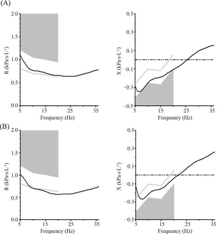
Figure 3.

Impulse oscillometry tracings on admission (A) and discharge (B). For clarity, only the mean curves of all trials shown in Figure 2 are displayed. Note that in both the resistance and reactance curves, the actual curve is further away from the abnormal gray shaded area on discharge compared to on admission. In addition, the resonant frequency (the point at which the reactance curve crosses the zero axis) is shifted to a lower value on discharge compared to on admission
