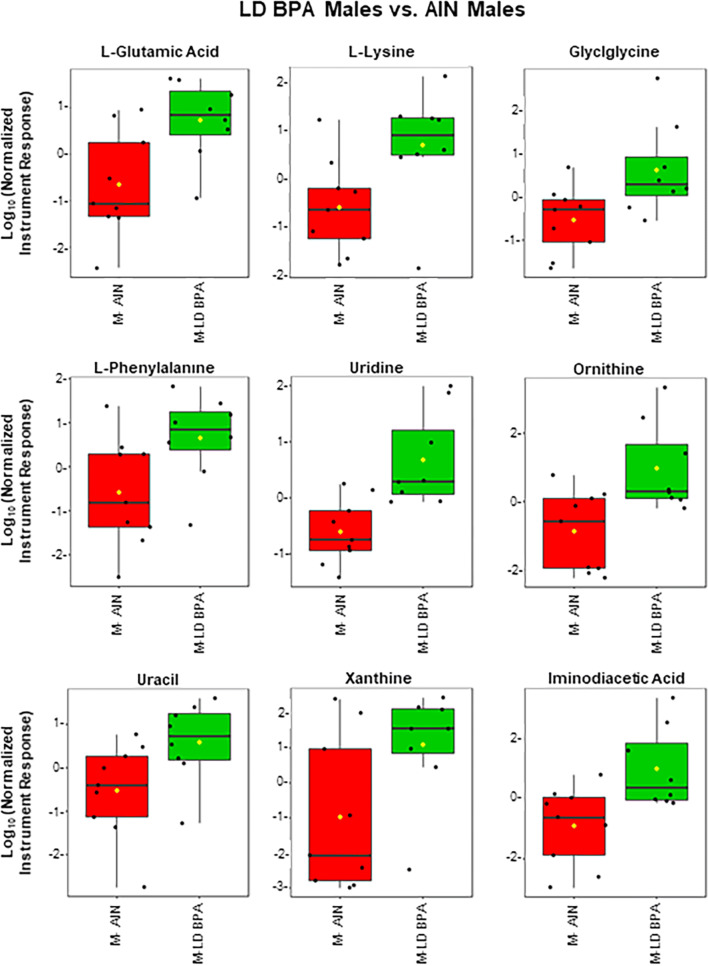
Figure 8.
GC–MS polar fraction results for LD BPA males vs. AIN males. Results for known metabolites that differ in this comparison are shown with box and whisker plots, which show the upper and lower quartiles. The median is designated with the vertical line inside the box. The yellow dot indicates the mean value. Lines outside indicate the lowest and highest observations. Each replicate is shown as a single black dot. Graphs were generated with the MetaboAnalyst Program v. 4.0 (https://www.metaboanalyst.ca/).

