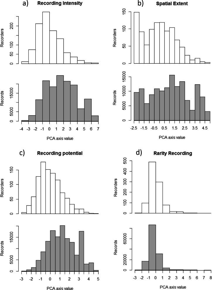
Figure 4.
The distribution of participants and records along the 4 axes of participant behaviour. Upper (white) plots show the distribution of participants while lower (grey) plots show the distribution of records (i.e. the sum of records contributed by participants in each white column). Number of records per participant is significantly positively correlated to the axes of participant behaviour in (a–c), and negatively correlated to (d) (see Fig. 5).

