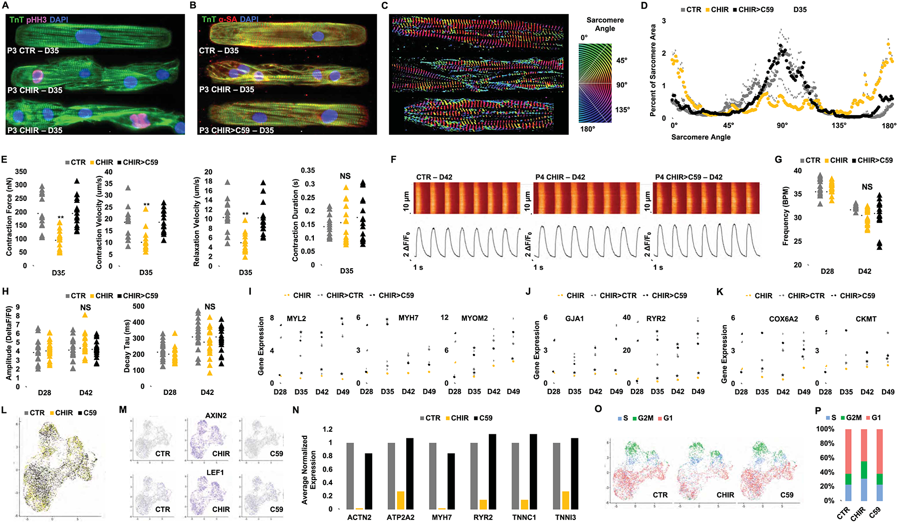
Figure 3:

Phenotypic assessment of hiPSC-CMs following GSK-3β inhibition and removal of contact inhibition (A, B) Confocal microscopy images of P3 (D35) hiPSC-CMs treated with either DMSO (1:5000) (CTR) or CHIR (2.0 μM) since P0 and (for CHIR-treated cells in B) subsequently treated for 6 days with either continuation of CHIR (2.0 μM) or replacement of CHIR with C59 (2.0 μM) (CHIR>C59) and immunostained on micropatterned surfaces for the expression of troponin T (TnT) and sarcomeric α-actinin (α-SA) or phospho Histone H3 (pHH3). Treated hiPSC-CMs were micropatterned as single cells to adopt rectangular morphology with 7:1 aspect ratio. (C-D) Representative images of distribution of sarcomere alignment. Color codes represent angle of α-SA with respect to cellular long axis (e.g. Z-disc-registered α-SA angle = 90°) (n=10) (E) Contractility measurements in cells treated in (B). (F) Ca2+ transients (Fluo-4AM) fluorescence expressed relative to baseline [F/F0] in hiPSC-CMs at day (D) 42 in hiPSC-CMs treated with DMSO (CTR), CHIR (CHIR) or CHIR followed by C59 (CHIR>C59). Plots displaying the Ca2+ transient (G) Frequency, (H) Amplitude and Decay for each group. Fold increases in the expression of sarcomere (I), electrophysiological (J), and metabolic genes (K) at the indicated days in hiPSC-CMs treated with CHIR from D12 to D28 followed by either continued treatment with CHIR, CHIR withdraw (CHIR>CTR) or replacement of CHIR with C59 (CHIR>C59). (L) UMAP plots of day 12 hiPSC-CMs treated with DMSO (1:2500) (grey), CHIR (4.0 μM) (yellow), or C59 (4.0 μM) (black) for 24 hrs. (M) FeaturePlot of Wnt target genes. (N) Average expression of the selected mature cardiac genes normalized to CTR. (O) UMAP plots for cell cycle analysis, S-phase (S) (blue), G2/M-phase (G2M) (green) and G1-phase (red). (P) Bar graph of the percentage of cells in different cell cycle phases. Scale bars represent 100μm. Dot plots represent biological replicates and average. Bar charts represent mean. Graphs represent average±SD. *p<0.05 and **p<0.005 by unpaired t-test. NS=not significant. Supplementary Table 1 specifies the replicates per experiment.
