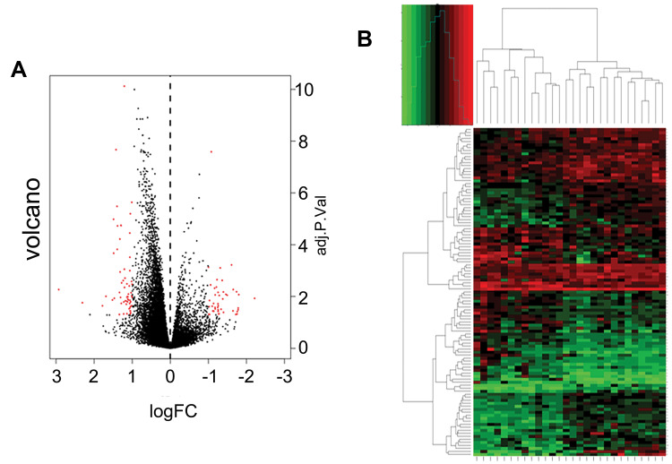
Figure 2.
Expression levels of genes and distributions in microarray data set. (A) Volcano plots of microarray data. Y-axis represents log2 FC. X-axis represents adjusted P-value (chemosensitive vs chemoresistant samples). Red dots indicate DEGs. (B) Heatmap of DEG clustering. Green represents downregulation and red represents upregulation.

