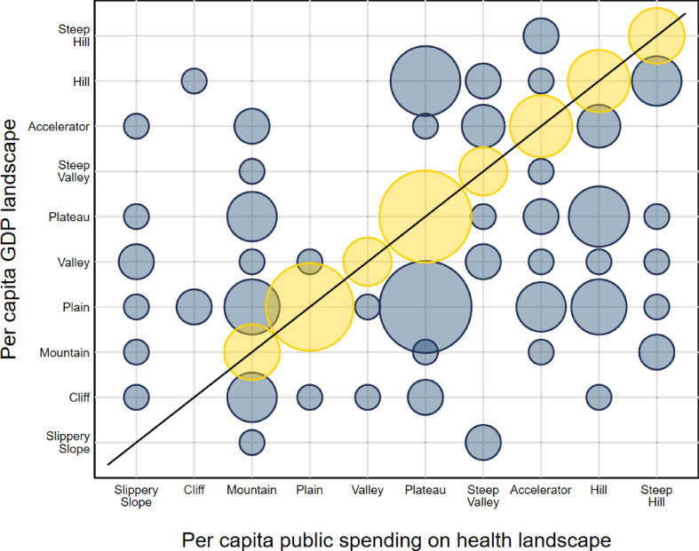
Fig. 2.
Caption: Landscape distribution of countries, 2000–2017, Source/Notes: SOURCE: Authors' analysis using data from WHO Global Health Expenditure Database. NOTE: Chart shows concentration of countries per combination of per capita GDP landscape and per capita public spending on health landscape. Larger circles indicate higher number of countries. Yellow circles indicate countries with the same landscape for both per capita GDP and per capita public spending on health. (For interpretation of the references to colour in this figure legend, the reader is referred to the Web version of this article.)

