Figure 3.

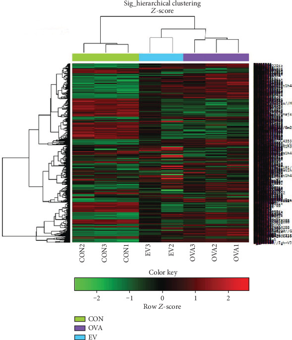
Hierarchical clustering analysis and heat map diagram. Green and red shading indicates down- and upregulated genes, respectively.

Hierarchical clustering analysis and heat map diagram. Green and red shading indicates down- and upregulated genes, respectively.